WalletWise Budgeting App
Setting
Final project for Austin Community College’s User Interface 2 class. This was a group project made up of a team of four members.
Audience
U.S College students, primarily focusing on students who are attending undergraduate programs.
Problem
Design a user-friendly fintech solution tailored to the specific financial needs and challenges faced by college students, focusing on budgeting, saving, and financial literacy.
Product
A simple, intuitive budgeting tool that helps college students categorize and track their spending in real-time.
Competitor Analysis
Our first step of the project was to research what already existing budgeting apps were doing, in order to see what elements work well and what elements did not work. Each one of us chose an app to research, with me choosing to focus my research on EveryDollar by Ramsey Solutions, since I was already familiar with it due to previous use.
Features that I found that worked well for EveryDollar included:
Onboarding quiz to determine users familiarity with budgeting
Used a zero based budgeting method (budget 100% of planned income)
Starts the user with common budget categories, but allows to easily edit, add, and delete categories
Connect bank directly to automatically insert transaction history, or allows the user to input transactions themselves
Analysis & Planning
Required Features
Per the project instructions, there were a few features that the app design needed to include. These were:
An onboarding screen for the app
Options to personalize your budget (Including several major spending categories)
Supportive educational tools within the app that are appropriate for the target audience
Credit score checker
HMW Statement
How Might We design an engaging but informational platform that helps college students have enough knowledge to take control of their finances.
Low Fidelity Wireframes & Feedback
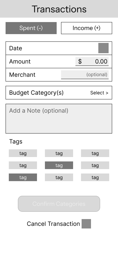
After coming up with our HMW statement and making a list of features that we were required to include, as well as wanted to include based off of our research, we created low fidelity frames to figure out what the best layout for the app. We then posted our lo-fi wireframes to the class MIRO board for feedback from our peers.
Designing
Assigning Pages
Our group decided to make the budgeting app be made up of 5 main screens. Since there were four of us in a group, we each took a page to focus on, with me doing two pages since I had more availability to be able to work on them.
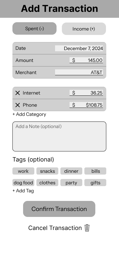
The pages that I was assigned to work on were the Transactions and the Insights into previous spending pages.
Design System
To create the design system, we each compiled a list of components that we believed would need to be included on our page, and then came together to make sure that we designed them to be visually consistent, as well as deciding on what would be the best colors and typography to use in the app.
Mid-Fidelity Prototype
When designing our mid-fidelity frames, we made sure to focus on what interactions and elements would be needed in order for the user to complete the desired task on the page.
For the Insights page, I wanted to make sure that users could view a breakdown of their previous spending, either for the past month or all included history. Within the breakdowns, I wanted to make it to where the users would be to view how much they had spent in different categories, such as food or entertainment.
For the transactions page, I wanted the user to be able to easily tell what transactions were income and which were money being spent, as well as be able to add individual transactions and attribute them to their respective categories.
Prototyping & Testing
Usability Tests
After everyone had completed their mid-fidelity frames, I connected them together to make a working prototype to use for testing.
I conducted the usability test of the mid-fidelity prototype on two of my acquaintances. The task results were categorized into three categories based off of how both users did: passed with no help, pass with help, and fail.
If the user got stuck on the test, they were provided with a single hint. The two times users were stuck, it was because they were on the wrong page or couldn’t find the page they were looking for. Once they were able to find the page they needed, they were able to finish the task as planned.
Results
Findings from the usability tests included considering:
Adding the ability to skip onboarding if the user if familiar with budgeting
Having spending groups in budget and insights set to be open when land on page, in order to reduce need for user actions
Changing the spending page on home page to be linked to budget instead of insights, since that is what was expected from the users
Rewording different sections of the app to make the function more clear to users
Post Testing Iteration
After synthesizing the findings from the usability tests, we iterated our mid fidelity pages to change what we found to not be working, into versions that lined up with the testing users actions.
Changed footer from “Wallet” to “Transactions” to make the goal of the tab more clear to users
Changed the view from being the last month only to be able to view all previous months if scrolled through - (forgot to add the arrows next to November 2024 to allow user to scroll)
Shows user how their spending was in relation to that months category budget
Can view that months transactions from highlighted category
Future Steps & Reflection
Since this was for a final project for our class, this is where the teacher had us stop and turn in our work. If I were to continue working on this project, changes I would make would include adding in the arrows to scroll through previous months on the Insights page, conducting future usability tests to see if the changes we made were beneficial, as well as making the app more accessible by making target areas, such as the open/close feature on budget and insights pages, have a larger target area for users with mobility issues, or editing spacing and colors in certain areas to make sure it was more accessible to users with visual impairments.
This project was also one of the first ones I conducted while being on team with other classmates, which helped give me valuable insights into how to work in a team as well as split work amongst the different members based off each others strengths and weaknesses.


